
How Typography In Web Design Can Improve Your Website
Typography in web design, for those of you who don’t know, is how your text presents itself on your website and how it relates to the overall theme and goal of the website.
Now let’s see a show of hands, how many of you web designers and conversion rate optimisers out there take the typography on a website into consideration? Typography in web design is like conversion rate optimisation in Internet marketing; it’s important, but not discussed often enough. Outside of header tags and bold text, I’m willing to be that not many of you think about typography, right? But what if I told you that typography can be used to convey a message about what your site is about faster than the audience can read? Sounds crazy, doesn’t it?
Well, it’s not that crazy. You see, whenever I design and red-design logos for businesses, one of the first things I take into consideration is what type of font I should use. Something you probably haven’t noticed is that certain brands use a specific type of base font (sans-serif and serif font) in order to make a statement about their products and services. For example, if you take a look at the Mercedes-Benz logo and the text on the Rolls Royce website, you’ll notice that they use a serif font. However, if you go to the website for McDonald’s, you’ll see that they use a sans-serif font across their website. If you weren’t able to ascertain the reason as to why they do this, then don’t worry since I’ll go over it in this article.
3 Ways Typography In Web Design Can Improve Your Website
1. Choosing The Right Typography Can Make Your Content Easier To Read
Have you ever been to a website where the webmaster uses some crazy-looking font for their body text? I’ve been to many sites like that, and let me tell you, I almost always leave the page a second after I land on it.
The problem with those “pretty” fonts is that it makes the text much more difficult to read. This is especially the case when you have traffic coming from different parts of the world where English isn’t someone’s first language. For example, on this website I chose to use the Times News Roman serif font as each individual letter is easier to discern for the 70% of my traffic that comes from English-speaking countries and the 30% that comes from non-English-speaking countries. Of course, using a serif font has other advantages as well as drawbacks, which I’ll get to next.
2. The Right Typography Can Make An Impression
Let me ask you, how do you want your site’s visitors to view your site? Do you want them to view your site as a source of cheap products and services, or is your target-consumer wealthy?
Going back to logo design, when I design and re-design logos for business sites, I often take the types of products and services the businesses offer into consideration before I select a base font to work off of. For example, let’s say I’m hired by 2 suit companies that want me to design a logo and a website for them. Suit company A sells cheap off-the-rack suits at a discount price while suit company B offers bespoke suits for high-end consumers. In this scenario, I would choose a simpler, sans-serif typeface such as “Arial” for suit company A while for suit company B, I would go with a serif font such as “Times New Roman” (the font used across this website) as serif fonts are usually, though not always associated with luxury. I follow a similar rule when I choose fonts to use on a website, although there are advantages and disadvantages of using serif and sans-serif fonts on websites.
Serif Fonts
- Advantages: They’re often associated with luxury and can provide your website with a more “premium” feel to it.
- Disadvantages: Serif fonts can be a bit more difficult to read on the web than sans-serif.
Sans-Serif Fonts
- Advantages: They have a minimal design,
- Disadvantages: The letters can be a bit more difficult to discern.
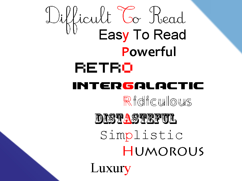
3. The Right Typography Can Draw Attention To Where It Needs To Be
Many of you are probably already familiar with using header tags both for organisational and SEO purposes. The same can be said about using bold tags in order to draw the reader’s attention to a specific word or phrase. Colouring text is another technique that’s commonly used; I personally like to chose a colour associated with the word (e.g., green for money).
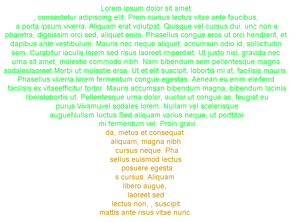
The more advanced techniques are also the most creative. For example, several years ago I encountered a short article about how people go after the low-hanging fruit on a tree, even though the fruit at the top of the tree, though harder to reach, is much better. What made this article memorable is that it was shaped like a tree! But, that’s not all, it was also coloured like a tree as well. I can’t seem to find the article, but I created a knock-off version with lorem ipsum text below.
In my opinion, this is the real power of typography in web design; the power to make your content memorable.
Conclusion
Not only can the right typography make your content readable, but it can also make it memorable. So you can either do what the “self-web designers” do and smother your website with a bunch of barely legible text, or you can make your content memorable by doing something unique and creative with your text like the tree-article writer did.
If you’re interested in other web design tips, you can also visit Spotlight as these often have articles on web design tips and tricks.

- Slow Website? Consider Robots As Being The Culprit - June 24, 2025
- My Experience Accepting Crypto Payments For The First Time - April 25, 2025
- Are Forums Dying? A Look Into Forums As A Whole - April 22, 2025
Leave a Reply